Footer In Web Design

Designing a creative footer is as important as working in all the other areas of a website.
Although the footer usually is the last thing on the page the visitor sees it and it shouldn’t be forgotten. Quite the opposite: I believe that we, designers, should make this bottom area design stand out. For many years copyright information, the website name and, in some cases the navigation links were the most common and sometimes only elements found at the bottom of most websites. Nowadays footers became more sophisticated including more information and also beautiful and creative designs.
![]()
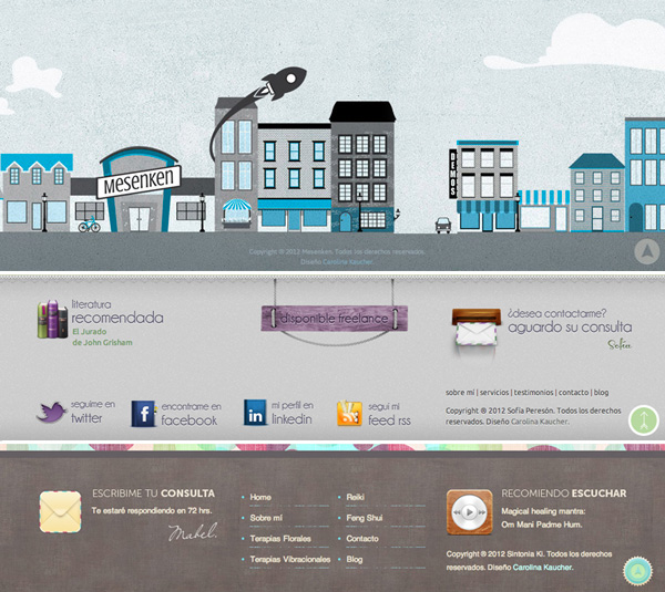
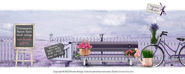
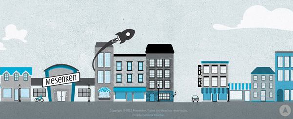
The good thing is that you have as many ways to call people’s attention as you can imagine. You can focus exclusively on the design, working on a really eye-catching graphic to make it stand out or you can work an also creative design but emphasizing on the most important information and so, get a more functional footer.
The most effective contents you may add there are navigation, contact information and social media links. All these three elements will help you improve your communications. When choosing this second option always keep in mind that you should guide the visitors to the more relevant contents of the website. It is also the place where you would put a back-to-top link.
Today I compiled some footers I have designed to share. I would really love to see your own designs as well. Please feel free to share them in the comments below. Do you follow any creative process when designing a footer? Which kind of footer do you prefer, the one that focus exclusively on design or the more functional/informative one?
Don’t forget to share your own footer designs in the comments below! ![]()


